Visualising Neural Network Stability
- Tiny decisions in architecture or training data can have huge effects on stability of a model.
- A 2D loss-landscape curve of the whole neural network, which helps us visualise its stability.
- Only a human decision-maker can decide how to evaluate the model's current stability.
Our coffee shop notices we sell considerably more coffee when it rains. In fact, we predict that we sell an additional gallon of coffee for every inch of rainfall. When it's not raining at all, we sell around four gallons, so that is a significant increase in sales that requires extra stock and staff. Our assumption has two parts.
- Bias (or base rate): 4 gallons is the average that is always sold on a day, so that is a bias of 4
- Weight: 1 inch of rainfall is assumed to be attributed to 1 gallon of coffee sales. So the weight of the rainfall feature is 1.
Today it rained 2 inches, and we sold 6 gallons, so our assumption looks correct so far. Based on this our weight and bias could be anywhere on this line.
Different combinations of weights and biases could explain this exact same outcome. For example, maybe our bias is actually 5, and we sell an extra half a gallon for every inch of rainfall. For now, we can just see how much rain there is and how much coffee we sell over the next few days.
Tracing the Blame (Backpropagation & Gradients)
Over the next three days, we get the following results:
- Day 1: rain: 4, sold: 7
- Day 2: rain: 1, sold: 5
- Day 3: rain: 0, sold: 4
On day 1, we expected to sell eight gallons (bias of 4 plus the weight 1 × rainfall 4), but we only sold 7. We were one gallon short. So we had a loss (or error rate) of 1.
Although we assumed four gallons of sales for the bias and four gallons for the rainfall, we attribute more blame to the rainfall prediction because we look at the multiplier size, not the outcome size; the rainfall weight affects the outcome four times and the baseline bias once. The weight of 1 influenced the final prediction four times, once for each inch of rainfall, so to correct more accurately, we should adjust it four times as much as we adjust the bias.
So we blame the bias 1 time and the weight 4 times. This is the derivative, or partial gradient, for each of these. When we put all the values into one long array, we have a gradient: [1, 4]
This is just for one day in our batch; the other two days had no loss, so their gradients look like [0, 0]. The average for the batch will therefore be [0.3333, 1.3333].
We don't want to reduce either the bias or the weight too much, since our original prediction was based on something; we don't know how typical today's results were, and we'll get more data tomorrow. So we multiply the gradient by our learning rate, which we could set to something like 0.05. So we multiply [0.3333 × 0.05, 1.3333 × 0.05] and get an adjustment of [0.0167, 0.0667].
If we adjust our weight and bias using this, we now get these new values:
- New bias: 3.9833
- New weight: 0.9333
As we'll be doing a lot more training on our neural network, it'd be great to visualise the model's stability. We don't want to train it for months only to have something go wrong and the model become unusable. The line plot we created above was a good way to visualise the model, but now that we have a little more data, a nice, clean 2D line no longer works. But also we don't have a simple correct answer either; we are now trying to identify the best prediction for every possible weight and bias combination.
In this 3D plot, we still have weight and bias axes, but we put the loss on the z-axis. If we adjust the model to test every possible weight and bias combination and see how accurate its prediction would be (how low the loss is), we get a loss landscape. So, with the data we have so far, we can see that the lowest loss is around a bias of 4 and a weight of 0.75, but we don't need a plot to see the lowest point. What is useful is that we see a nice, smooth surface and a very small correction to the optimal position. If the curvature had steep cliffs, gorges, or rough patches, that would signal a problem; a small movement next to a cliff could cause a large change in loss, and a model where a tiny change causes a large change in loss has something wrong with it.
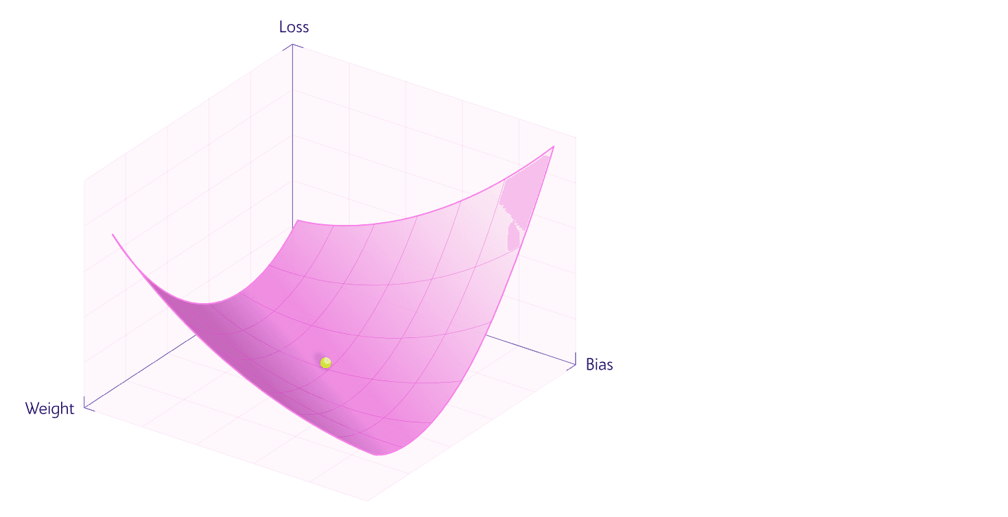
There are two issues with a 3D plot:
- It's 3D: we should avoid 3D plots when we can, because it's hard to see small, important details.
- It only works with a single weight and a single bias.
We can fix both with a technique called filter-wise normalisation: we choose a delta to multiply each weight and bias by, then add them together to create a unit for a single axis. This gives us two options: one uses a single filter-wise normalisation axis and compares it with the loss; the other creates two axes and we view it as a contour plot.
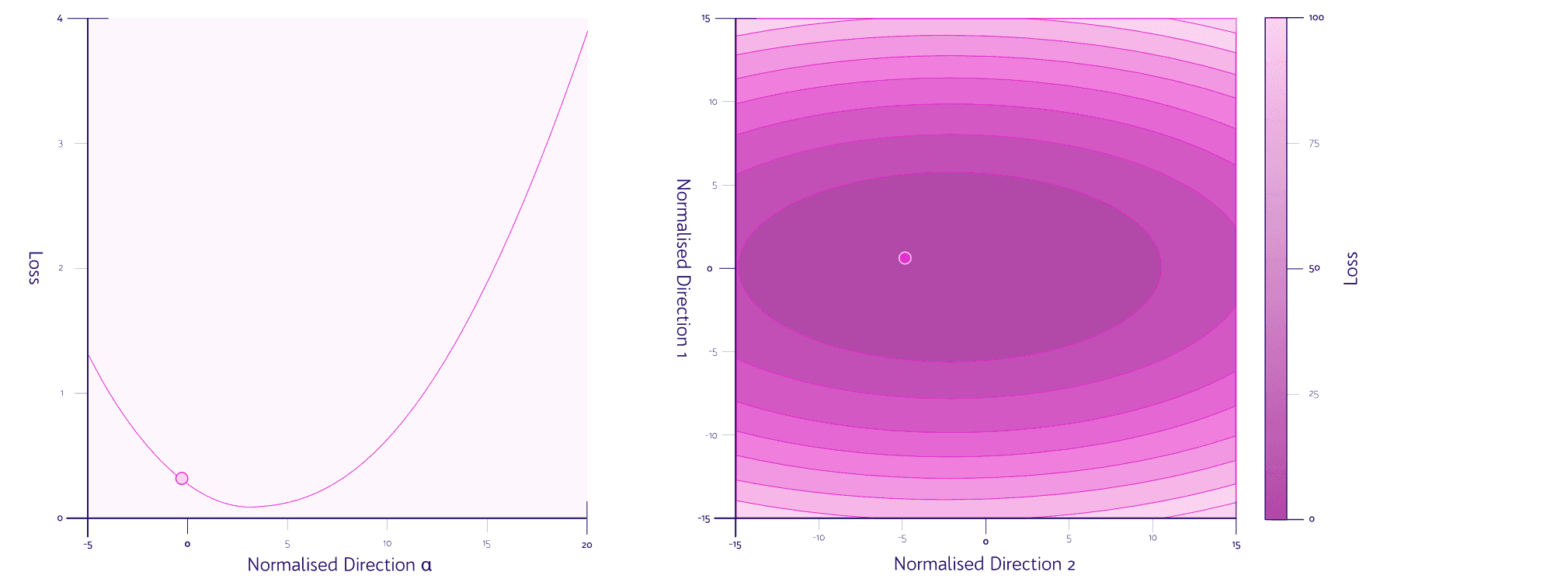
After experimenting with both for some time, I've found the simple line plot to be easier to create, read, and use to identify phenomena that show our network is unstable. The line plot has the following advantages:
- No need for a key or a colour channel.
- The majority of the ink in the contour plot is dedicated to information with limited benefit.
- The line plot scales better; when adding future batches, we can use the same plot.
- The contour plot can significantly change its meaning if it's squashed or scaled incorrectly.
So now we have a way to visualise our model's stability as we continue training it. Let's sell some more coffee and see what issues can come up.
Simulating Trajectories & Reading the Terrain
Over the next few weeks, everything that could go wrong did go wrong for our little coffee shop prediction model. Luckily, whenever we spot it in our visualisation, we have techniques to fix each problem and retrain on that batch.
Exploding Gradients (Steep Cliff)
During our next batch, the worst storm in decades hits: 37 inches of rainfall on the same day the marathon comes to town. Thousands of spectators hide in the coffee shop while waiting for their soggy friends to run past. They consume some 52 gallons of coffee.
This is an outlier day; even when averaged over two typical days, the rainfall number (our input feature) is so large that it forces our model to make massive adjustments to our rainfall weight. It overcorrects, assuming rain means a huge amount of coffee sales.
We've overshot the lowest loss point by quite a bit, and we have an insanely steep curve, which suggests there is something wrong with the curvature.
We aren't necessarily expecting the point at the very bottom, especially since we had a big freak storm and a marathon in this batch; it's not typical, and we shouldn't expect the model to predict it perfectly. But the curve's steepness is a problem: a small movement can make a huge difference, and this batch moved the model a lot.
We absolutely have to roll back this training set and rerun it with some changes:
- Lower the learning rate: 0.05 is too high; it would train much faster if we didn't overshoot, so ironically, having a smaller learning rate would actually train the model faster.
- Normalise the input feature: passing a raw number like 37 directly into the model leaves it vulnerable to spikes. Normalise this number, for example, to a score between 1 and 5 or on a logarithmic scale.
We roll back the batch, lower the learning rate and set the rainfall input to 5 for that day. We then get a nice, smooth loss curve with much smaller movement.
Ill-Conditioning (Asymmetric Basin)
The model is doing better, but on the days we overestimate, we waste some milk and have a staff member come in just to play on their phone; on the days we underestimate, we're forced to turn grumpy, un-caffeinated customers away.
One wastes a bit of money; the other is a reputational disaster. To our business, they aren't the same.
We need a loss function that adjusts the penalty to punish underestimation more than overestimation. We use a loss function called Pinball Loss (sometimes called Quantile Loss). Instead of treating every mistake the same, it multiplies positive errors (underestimations) by a heavy penalty weight like 0.8, while negative errors (overestimations) are multiplied by a light penalty weight like 0.2.
We train on a batch and check out our loss landscape curve: rather unsurprisingly, we now have a steep curve on one side and a gradual one on the other. (It's very easy to connect the cause and effect in our insanely simple example, but in the real world, multiple things could contribute to this phenomenon in the loss landscape.) We have the same problem as before: a tiny movement in one direction can have a huge effect on our loss.
Is there a better way to deal with this?
- Add a bias to the output: as we know, we want to overestimate; we could manually add 15–20% to every prediction the model outputs when ordering and scheduling.
- Loss function reset: a four-times penalty for underestimation may have been a bit aggressive; maybe we adjust our loss function so underestimations are only treated as 1.5× as bad as overestimations.
We decide it's best not to mess with our model and instead manually assume we'll sell 15% more every day than the model predicts.
Saddle Point (Faint Slope)
Suddenly it occurred to us that people don't work on weekends and have more time for coffee, or at least don't have access to their office coffee machine. We add a new input for weekends, set to 1 on weekends and 0 on weekdays. For the next few weeks, it seems to rain only on weekdays, and on the nice, sunny weekends everyone has a BBQ.
Our loss landscape curve ends up flat in the middle.
We got into a kind of maths deadlock; it never rained on the weekends, so we learned nothing about how they relate to each other. We get extra customers on weekends because they aren't at work, and we get the same amount of customers on weekdays because it's raining. Our model thinks it's found the ground because it's flat, but it's on a saddle point.
The solutions to this will be slightly more complicated than the previous examples:
- Momentum in gradient descent: remember the model's last adjustment and keep moving a small amount in that direction.
- Adam optimiser algorithm: keeps track of recent adjustments and gives a varying learning rate. For example, if no adjustments have been made for more than x batches, increase the learning rate of the last adjustment.
- Data shuffling in machine learning: shuffle our training data so we don't put the rainy Sunday at the top of our training data, or pause training until we get a rainy weekend to train on.
Our model is doing well up to this point, so we decide to just wait until a rainy weekend before we continue training. The lowest-tech solution is normally the best after all.
Noise (Rough)
After the success of adding weekends, we add hundreds of new input variables into our model: wind speed, hours of daylight, current price, advertising spending, etc. Then we add hidden layers to see how these variables combine; maybe promotions work better on weekends because people buy less habitually on weekends. Our model only knows this if it has some hidden layers. To keep the numbers from getting crazy as our model grows, we add a simple activation function (a function that constrains or adjusts a node's activation) and choose the most common one, called ReLU (Rectified Linear Unit), which prevents hidden nodes from activating below zero and is very fast.
We train our model and find our predictions jump around like crazy: our model predicts that if we charge 1p more for a cup of coffee, we make more sales, but if we charge 2p more, we make way less.
Looking at the curvature of our loss landscape, we see a sawtooth curve.
We added far too many new inputs without the other things needed for such a sophisticated model. A tiny change early in the model can cause massive jumps later as the inflated interpretations of subsequent layers compound. Layer 3 thinks a specific adjustment in layer 2 is much more important than it is. This is partly due to our activation function, ReLU, which has a binary cutoff at 0; if a hidden node thinks an increase in cost negatively affects the final prediction, it cuts that off at zero. Different hidden nodes' binary cutoff points create jagged peaks and valleys that can trap us and leave our model unsure which direction to go.
The solutions are more trial and error now, so we just need to know what we're looking for in the visual and what to try to fix it:
- Smooth activation functions: while ReLU is fast, once we see a problem in the loss landscape, we should try switching to something like GELU or Swish, which doesn't have a binary cutoff point.
- Skip connections: give each layer in the neural network the activations of previous layer(s), so spikes in activation values can be ironed out as it learns from more information.
- Batch normalisation: averages the activations of all nodes in a layer over the whole batch and normalises a node's activation in a hidden layer, for example, to keep them between -1 and 1.
We decide to use GELU instead and normalise all node activations to values between -1 and 1.
Loss Barrier
After a year or so of using this model, we realise that we get more accurate predictions by having a summer model and a winter model. We train and use each for six months of the year and find we get more accurate results, but it becomes awkward, so after some time we decide to combine them. We just average every weight and bias in the model.
We've got a loss barrier. There are two flat areas where the loss is low using all our training data so far, and the new merged model puts us on a mountain at the top. We can't really train two separate models and average them together like this. In this example, the solution is more obvious, but if this happens normally, it means our model has found two distinctly different ways to solve the same problem, and we can try:
- Cyclic learning rates: vary the learning rate between batches. This means the model can jump the mountain to the ideal side.
- Stochastic weight averaging: average weights from the model across a few different batches of training. Harder to explain, but it can get it onto the ideal side of the peak.
- Increase network width: add more width (more neurons per layer), which just gives it more processing power to figure out which side it should be on.
In our example, we simply combine all the existing training data and retrain a fresh model, since we know exactly where the problem came from.
Flat Minimum (Wide Basin)
After all these iterations and fixes, we finally get a loss landscape curve with a large flat basin, and our model sits comfortably inside it. We're getting good predictions, and more importantly, the curvature suggests the model is stable for more training without issues. As long as we keep an eye on it and use other diagnostic tools.
If the model shifts slightly tomorrow, we'll see only a small adjustment in our loss and model.
A Tool To Visulise Model Stability
After all this, one question remains: why doesn't our model watch this curve and figure all this out by itself? We could have an AI agent try to do this, but we'd still like to know what it's doing. We calculate the curve after a batch, and once we have thousands of nodes with all their weights and biases, it could take years to compute this curve with its estimated loss at different positions, so we use multivariable calculus approximations instead. It's important to know how the curve was created because how much variation in our model's stability we're willing to allow is a decision for us as humans who know the budget and the trade-offs we're willing to make.
Further Reading
- Norms / condition number: Andy Jones — Condition numbers
- Derivative: 3B1B — The paradox of the derivative
- Gradient descent: 3B1B — Gradient descent
- Bridge (eigenvalues → stability): Setosa — Eigenvectors and eigenvalues